2022 LONDON WEB DESIGN ADVICE: WHAT’S HOT THIS YEAR?
Your website’s trustworthiness is heavily influenced by its appearance, and certainly, a bad user experience could cost you potential clients. You cannot let design suffer in favor of utility and usability, which are both vital aspects of your website. In order for your company’s brand to be the backdrop, your background colors, spacing, and other visual components must all be cohesive. Take into account these as we usher in a new year. London’s top tips for website design in 2022 to improve the visual appeal and usability of your website.
WEB DESIGN TRENDS FOR 2022 YOU NEED TO KNOW
Changing technological trends (which is why our website design services in Manchester stay so busy). The evolution of design elements and website functionality can be seen by merely examining recent years. The text-heavy, feature-rich websites of the 2000s and 2010s contrast with the modern, minimalistic aesthetic.
1. REDUCING “FRIction”
You should try to stay away from using too many visual components that compete for attention because simple, clean design is currently in vogue. A busy web page is one that uses complex animations, an excessive amount of copy, and a variety of textures, colors, and fonts. Anything on a website that would detract from the topic should be removed, according to a true minimalist. Instead of adding extra features, you should pick an essential emphasis for your design and emphasize it.
2 THE EXPANSION OF MICRO-ANIMATIONS
Users continue to adore videos, and they always will. But too many videos can significantly slow down your website, which is one of the reasons GIFs and other types of micro-interactions are so well-liked. They may not be able to tell the story of your brand or provide detailed instructions on how to use your product or service (keep those concepts for video), but they may be a very powerful tool for getting website visitors to take action.
3. BOLD COLOR PALETTES
It’s not necessary to have a boring minimalist design. Without depending on garish, oversaturated features, a bold, vibrant color palette can help your website stand out. A monotone design can become more eye-catching by incorporating even a single contrast shade. White space need not always be white!
4. PARALLAX SCROLLING
As a result of this technique, your design has levels, depths, and a sense of visual hierarchy because the backdrop moves more slowly than the foreground information. Additional benefits include the ability to highlight forms and calls to action.
DESIGN GUIDELINES FOR EVERGREEN WEBSITES
Making a good design that will last you for a few years is important because it is neither practical nor cost-effective to keep inventing the wheel. While the aforementioned trends are popular right now, the following will remain relevant and appealing to website visitors for many years to come.
- Include accessibility features like keyboard navigation, closed captioning for video material, and alt text for images.
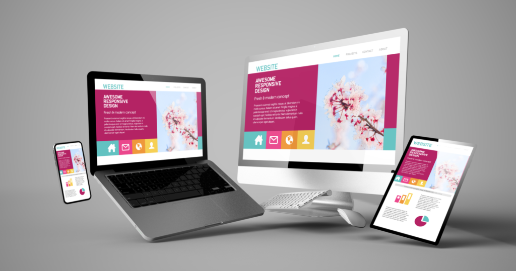
- Construct a thumb-friendly responsive web design.
- At the top of the pages, use an H1 header structure.
- Make CTAs that include clickable links to case studies, form requests, and other resources, as well as article downloads.
- To promote testimonials, add a module (or even a new web page) to your website.
- It’s crucial to know the kind of photography to seek out when you can’t avoid using stock photos because original photos almost always outperform them. Finding pictures of actual events rather than corny pics of people high-fiving and joining hands is the most crucial factor.
Contact Markustudio for more information on the newest trends and assistance incorporating these modifications onto your own website. A freelance web designer in Manchester offers services for digital, print, and online design as well as logo and brand development.